
Nearly two decades ago, affiliate marketers generally understood that ugly sites that look like they were built by a child tended to convert well. Major websites were using exceedingly plain designs. Though it may seem counterintuitive to purposely create an ugly site, it might be worth the time to revisit that old affiliate marketing strategy of ugly sites sell.
Today, the ugly sites sell paradigm isn’t well-known. But, it was a well-tested marketing strategy that affiliate marketers used in the early days. Many major websites today use a variation of those ideas discovered nearly 20 years ago. Revisiting this strategy helps to understand how it came to be and how you might be able to adapt it today.
Affiliate marketers gathered around drinks and appetizers at PubCon Boston 2003. They had each independently discovered that making their sites usable but ugly increased sales. One of the most well-known affiliate marketers, Mike Mackin, posted a discussion titled “Ugly Sites Sell”, on WebmasterWorld in June 2003.
The post became one of the most influential discussions from that platform whose influence continues to be felt today. That discussion inspired marketers to split test different designs, including ugly websites that were built for speed, conversions, and usability.
One participant in that discussion from 2003 objected to the ugly site paradigm and suggested that maybe nobody is making ugly sites on purpose. Another legendary affiliate marketer indicated that he was very much purposely making sites that were ugly.
You can still find this discussion online at WebmasterWorld today, but it is hidden behind a paywall.
The Huge Buy Button
Making the “buy” button huge was a critical part of the ugly sites sell approach.
Split testing of the ugly sites strategy discovered that making the buy button large, sometimes to the point of dominating what was visible on the website increased sales. Making the buy button huge increased conversions.
“Ugly” Sites Today
It may sound ridiculous but we still see the strategy in different forms today.
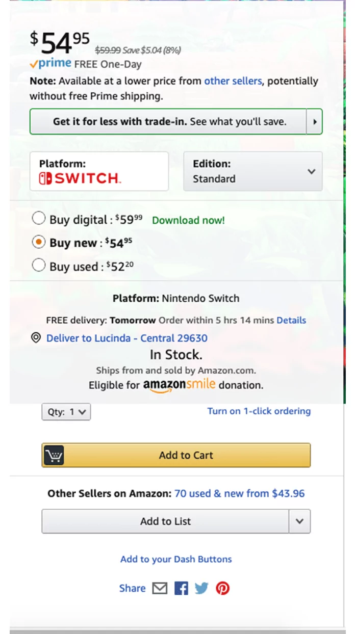
For instance, take a look at this large buy button area on Amazon. This huge call to action wouldn’t be in use if it weren’t effective.
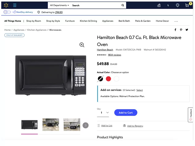
And look at Walmart’s approach. It makes the buy button stand out. The idea of making the buy buttons stand out from the rest of the site may have had roots in magazine advertising, but the strategy was tested and independently discovered by online marketers.
Major Corporations Use Plain Websites
The appearance of a site is just one of many factors to consider when it comes to conversions. However, major corporations such as Wal-Mart and Walgreens, Operate with plain-looking web pages that some may even describe as ugly. We can bet that those companies wouldn’t use that design if it weren’t converting for them.
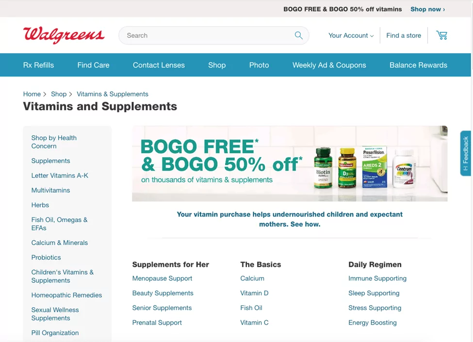
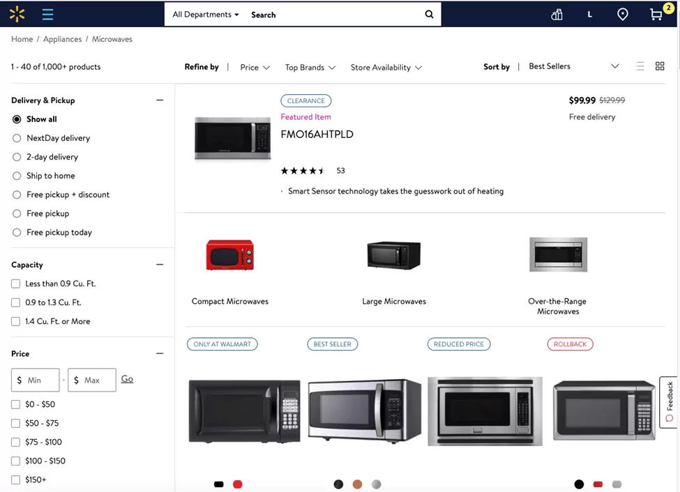
Looking at the screenshots you can see that their web presence can be described as playing at best and ugly at worst. But we know the sites are successful and because if they weren’t, we could expect them to be updated to use a flashier design.
It’s obvious that some of the factors from the ugly sites sell movement such as the highly visible by button remain as relevant today as they were nearly 20 years ago. Examples of sites like Walgreens and Walmart provide evidence that there is a place for plain-looking websites.
What do you think?
Eric Sachs
SEO virtuoso, CEO @Sachs Marketing Group. Focused on being of service to business owners - helping to better position them in the eyes of their audiences.